I realize that they are using Robinson, Weinberg and Broecker’s book, Art of Imagination, as their reference, but that book is WRONG. There will be no signature to prove that this is Drew. (I don’t have that book, but the style is Fisk’s, NOT Drew’s, and so I know that they don’t have a signature or any other proof to show they are right.) They are just going on stylistic signatures and they made an error, is all. I am versed in Drew’s style and now I can also recognize Fisk’s style, and sure, there can be some mix-up if you don’t know both styles. It’s easy to make that mistake if all you know is Drew’s style.
When I posted the first comment, I knew Drew’s style, but not Fisk’s style, but I DID NOT call this Drew. Instead, I referred to that site only. Why? Because something was OFF about it. My crystal ball didn’t register Drew, even though there were similarities between the two styles. So I pointed to that site until I had made up my mind about it.
But now the crystal ball shows “Harry Fisk” plainly. You can leave it up as Drew if you want, but it’s completely wrong. If you need more evidence to back me up, go ask marc to take a look at all the Drew covers I’ve identified and then to take a look at the Harry Fisk covers I’ve identified. Then ask him if he thinks this is Drew. He will say, “No. It looks like Fisk to me.” That guy has a very good eye for detail. He can see artistic styles as easily as I can. He will back me up on this.
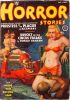
First, I notice the same wrong perspective (going upward) and the same floor pattern.
Second, the composition is identical, with a couple of women in the background tied with a rope around their waist.
Third, most important, the faces of the women are similar : a long straight and narrow base nose, a round chin and hair like a wig (not mentioning the eyes).
Different other technical drawing details match (neck base shades, stains of grey on men faces, same greyish wood etc.)
Conclusion : I think that you would also find Harry Fisk’s signature on the original painting somewhere in a darker part of it, as it is on the lower left of the other one.
Yes Kelly, this cover has been painted by Harry Fisk.


John Drew, per:
http://www.isfdb.org/cgi-bin/pl.cgi?398394
If this is John Drew, then so is Girls For The Spider-Men:
https://pulpcovers.com/girls-for-the-spider-men/
The style is the same. (Heck, even the set-up is the same!) Therefore the same artist did both paintings.
No, no, no. They got it completely wrong. It’s not John Drew. It’s definitely Harry Fisk. I’ll bet all the money in the world on it.
The other cover also is Harry Fisk.
https://pulpcovers.com/girls-for-the-spider-men/
I realize that they are using Robinson, Weinberg and Broecker’s book, Art of Imagination, as their reference, but that book is WRONG. There will be no signature to prove that this is Drew. (I don’t have that book, but the style is Fisk’s, NOT Drew’s, and so I know that they don’t have a signature or any other proof to show they are right.) They are just going on stylistic signatures and they made an error, is all. I am versed in Drew’s style and now I can also recognize Fisk’s style, and sure, there can be some mix-up if you don’t know both styles. It’s easy to make that mistake if all you know is Drew’s style.
When I posted the first comment, I knew Drew’s style, but not Fisk’s style, but I DID NOT call this Drew. Instead, I referred to that site only. Why? Because something was OFF about it. My crystal ball didn’t register Drew, even though there were similarities between the two styles. So I pointed to that site until I had made up my mind about it.
But now the crystal ball shows “Harry Fisk” plainly. You can leave it up as Drew if you want, but it’s completely wrong. If you need more evidence to back me up, go ask marc to take a look at all the Drew covers I’ve identified and then to take a look at the Harry Fisk covers I’ve identified. Then ask him if he thinks this is Drew. He will say, “No. It looks like Fisk to me.” That guy has a very good eye for detail. He can see artistic styles as easily as I can. He will back me up on this.
Since you mentioned my name, here is my analysis :
I shall take this painting to compare it with :
https://pulpcovers.com/tag/harryfisk/
First, I notice the same wrong perspective (going upward) and the same floor pattern.
Second, the composition is identical, with a couple of women in the background tied with a rope around their waist.
Third, most important, the faces of the women are similar : a long straight and narrow base nose, a round chin and hair like a wig (not mentioning the eyes).
Different other technical drawing details match (neck base shades, stains of grey on men faces, same greyish wood etc.)
Conclusion : I think that you would also find Harry Fisk’s signature on the original painting somewhere in a darker part of it, as it is on the lower left of the other one.
Yes Kelly, this cover has been painted by Harry Fisk.
Well, the painting to compare it with is this one :
https://pulpcovers.com/playthings-for-madmen/#1
Meanwhile, that “damsel in distress” looks like a sorority girl at a frat party: “You creeps need to grow up, swear ta gawd.”